Journey:
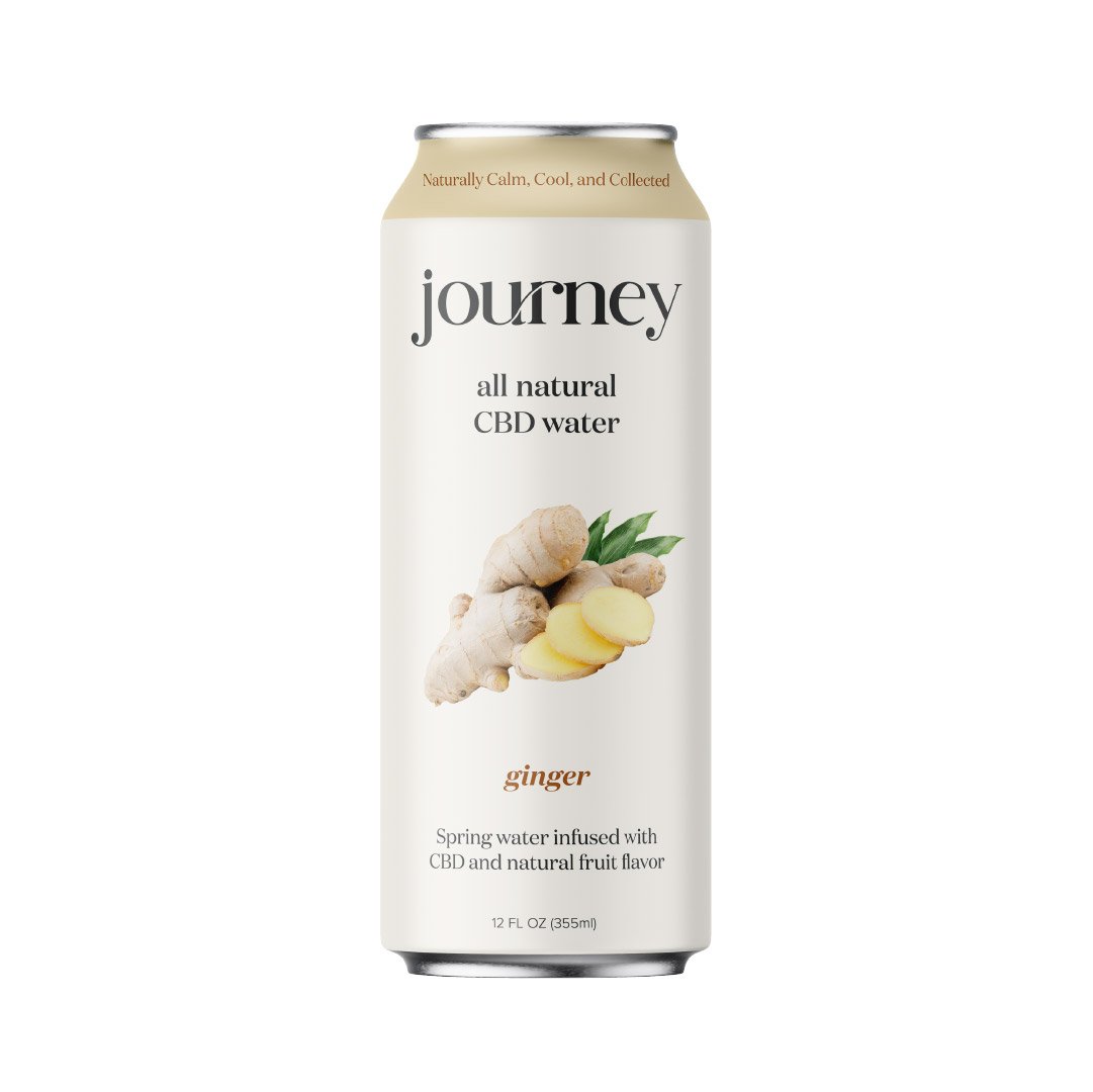
Journey is a new CBD beverage company seeking branding and packaging design. The product is marketed towards young professionals looking for natural ways to relax. These individuals are health conscious and prioritize natural ingredients. They are willing to pay a premium for a water option they can feel good about consuming and supporting. The ultimate design reflects youthfulness and a sense of refined playfulness with a color palette that embodies a sense of calm.


The Journey logo, with its playful ligature, is itself evocative of the path one takes on a journey. The logo font strikes a balance between playfulness, trendiness, and modern luxury — characteristics that speak to the target consumer base. Calming pastels and muted tones such as beige and dark grey (as opposed to a harsher black and white) further establish a serene vibe. The high resolution, sihouetted imagery of fresh fruit directs focus to the product’s natural ingredients, avoiding any unnecessary visual distractions. The minimalistic packaging design suggests a high end product while the fonts, logo, imagery, and color paint a youthful and fun, yet still refined picture. The distinct use of color on each SKU empowers consumers to easily distinguish products on the shelf. With this new branding and package design. Journey is now well-positioned to stand out on the shelves and capture the attention of it’s audience.